


Why this project is interesting
As the company scaled, the existing platform was hitting its limits and lacked design consistency. And with close to ten thousand daily readers at the time, how could someone surface what they wanted from a deep sea of articles, columns, varied publishing formats, and paid-and-free content sitting side by side?
The old site no longer met the need and felt inconsistent, so I came in from the angle of improving the site experience: framing the client’s problems, defining design goals, running user research, translating it into a Hifi-Prototype, and finally supporting handoff with the client, brand visuals, and engineers.
Design goals & challenges
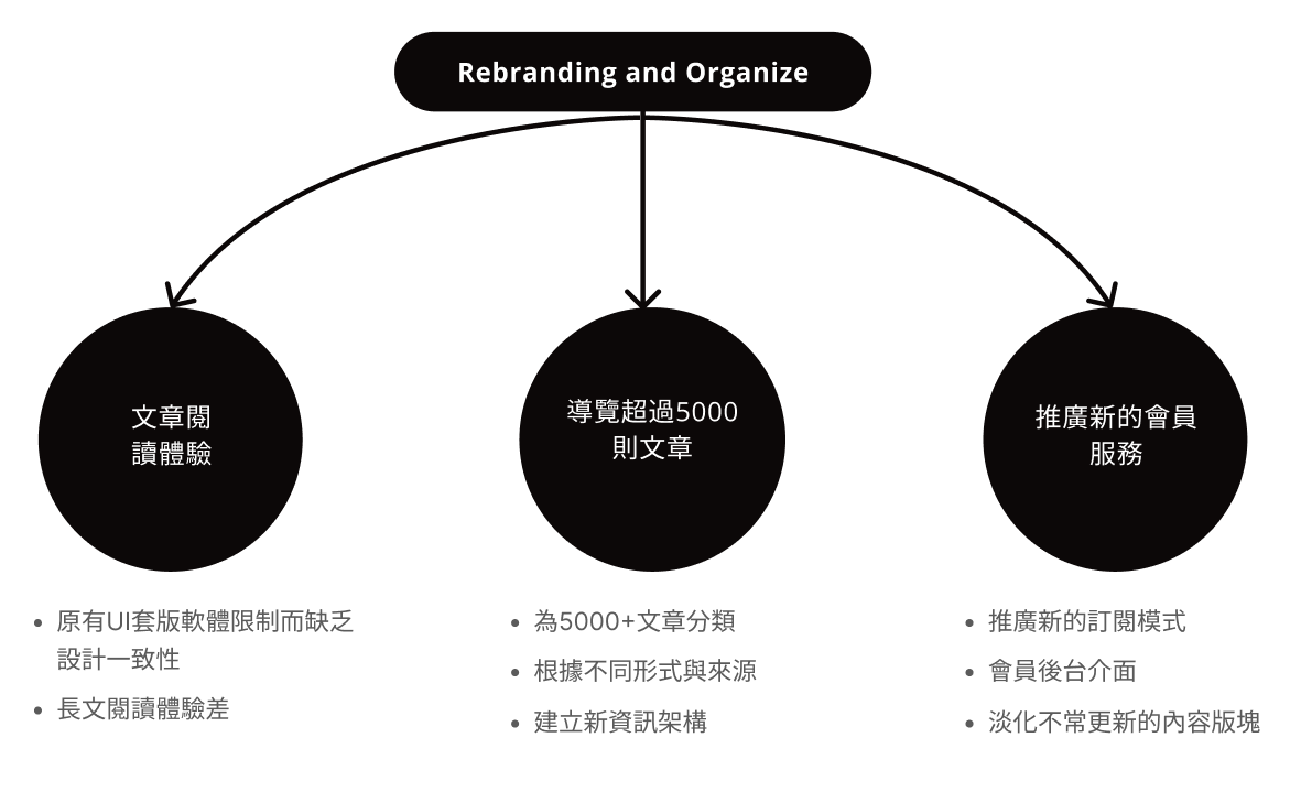
The platform already held 5,000+ articles, each potentially differing in source, publishing method, and presentation format. The task was to present them better—without adding to content producers’ workload, and without compromising the paid readers’ experience.
User research: look at the data first
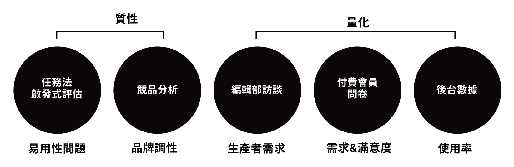
To define the site’s design direction, I brought in professional input and data from real users as the foundation for design.
Heuristic evaluation
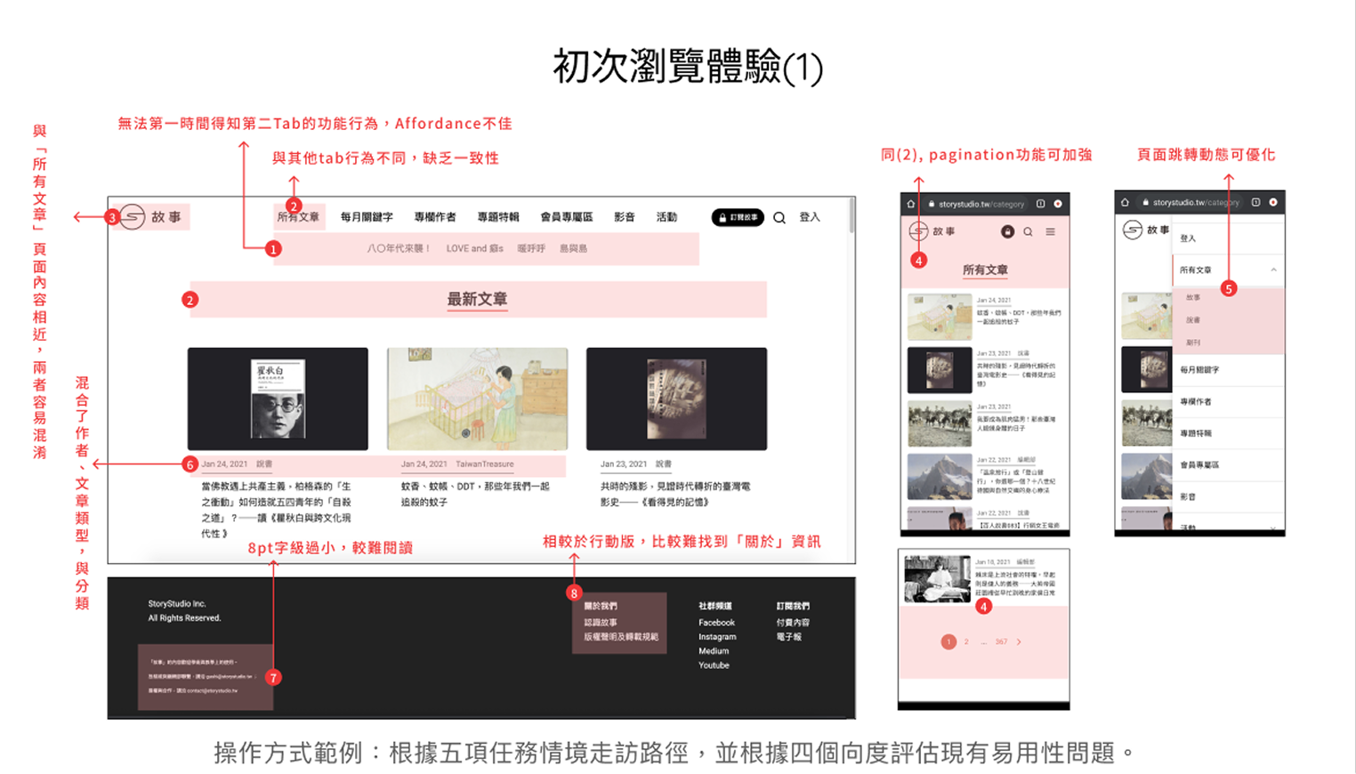
I set up five primary task scenarios (first visit, reading long-form, finding articles, membership, contacting StoryStudio) and walked the existing site page by page, logging usability issues. I then grouped them by “effort to fix” into four buckets—wording, interface visuals, functional efficiency, and flow/structure—to distill the pain points and a fix priority.
Cross-analysis: survey + backend data
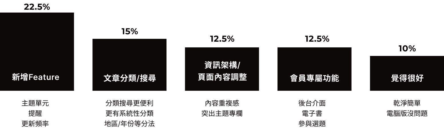
Surveys capture readers’ subjective feelings; backend data shows what they actually do. Only by overlaying the two can you tell “readers find it hard to use” apart from “readers simply never use it”—two problems with completely different fixes. I coded 39 survey responses, ranked them by issue frequency, and matched them against per-page traffic to pin down the pain points worth addressing.
Two key insights came out of the traffic analysis:
- Search was too clunky, so usage stayed low: Backend data put search usage at just 0.46%—likely too awkward for anyone to bother. Weighing dev cost, I chose to meet the underlying need through recommendation and classification, keeping only a simple search.
- The traffic secret: articles get reach, but are hard to find: Readers mostly arrive through social posts and land straight on articles, while homepage reach is only average. Popular and classic pieces keep drawing traffic over time, yet grow hard to rediscover after a while.
Competitive analysis
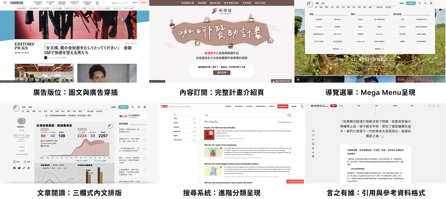
To grasp the design trends of editorial-style sites, I compared several media platforms of varying scale and synthesized their shared design language—ad placements, content subscription, navigation menus, three-column article layouts, search systems, and citation formats—as a reference baseline for design decisions.
Design concept: four optimization tracks
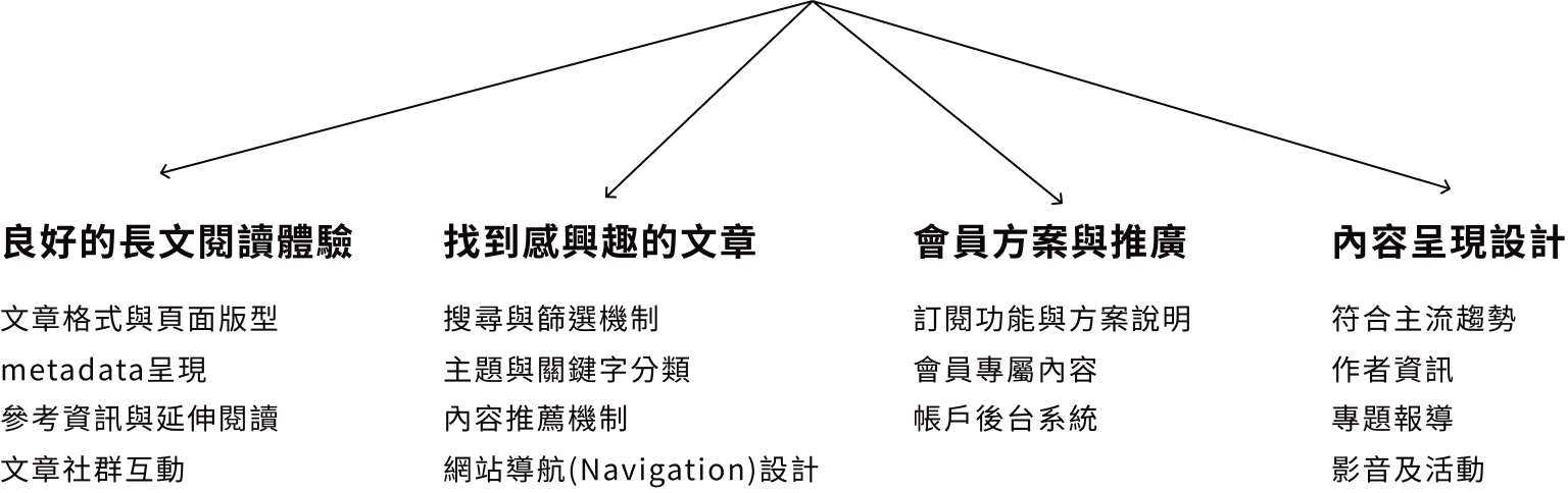
I defined the items this project needed to focus on and broke them into four main goals—which also map neatly onto four parts of the wireframe work.
Information architecture
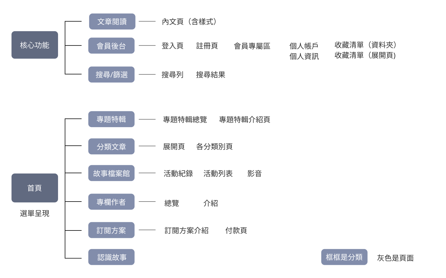
I rebuilt the article organization system so readers could easily discover what they wanted, while still fitting the editorial team’s writing needs and constraints.
Approaching the solution from information architecture lets a content site get a firmer grip on front- and back-end development needs, and gives you a more detailed strategy for page layouts before moving into wireframes.

Wireframe design
Homepage
The homepage goal: give readers something to look at the moment they arrive, while conveying that the platform is rich and diverse.
Let readers get to know StoryStudio
- Make it obvious what content we have
- Convey a witty, intellectual tone
Help readers find their point of interest
- Surface the articles readers care about quickly
- Clearly explain the subscription service
- A 2:1 mix of paid to free recommendations, so free articles aren't too scarce
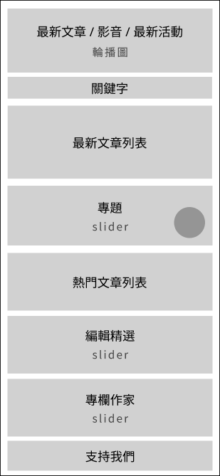
I went with full-bleed columns for an immersive browsing feel, a carousel to counter the sense of “low update frequency,” and a 2:1 mix of paid to free article recommendations—so free readers aren’t left with too few choices or the impression that “all the good stuff costs money.” The mobile layout stays as close to desktop as possible to reduce the cognitive gap across devices.
Long-form reading experience
Long-form reading is this site’s most core scenario, so I put a lot of effort here. Beyond the basic responsive paragraph and type sizing, the main feature is a three-column layout—main body, side-column ads, and article referral columns side by side—balancing reading flow with commercial needs.
I also consolidated a guideline for the article’s components, laying out every UI style systematically, and produced a sample article for the visual designer to refine—ensuring a consistent standard for later execution.
Subscription flow optimization
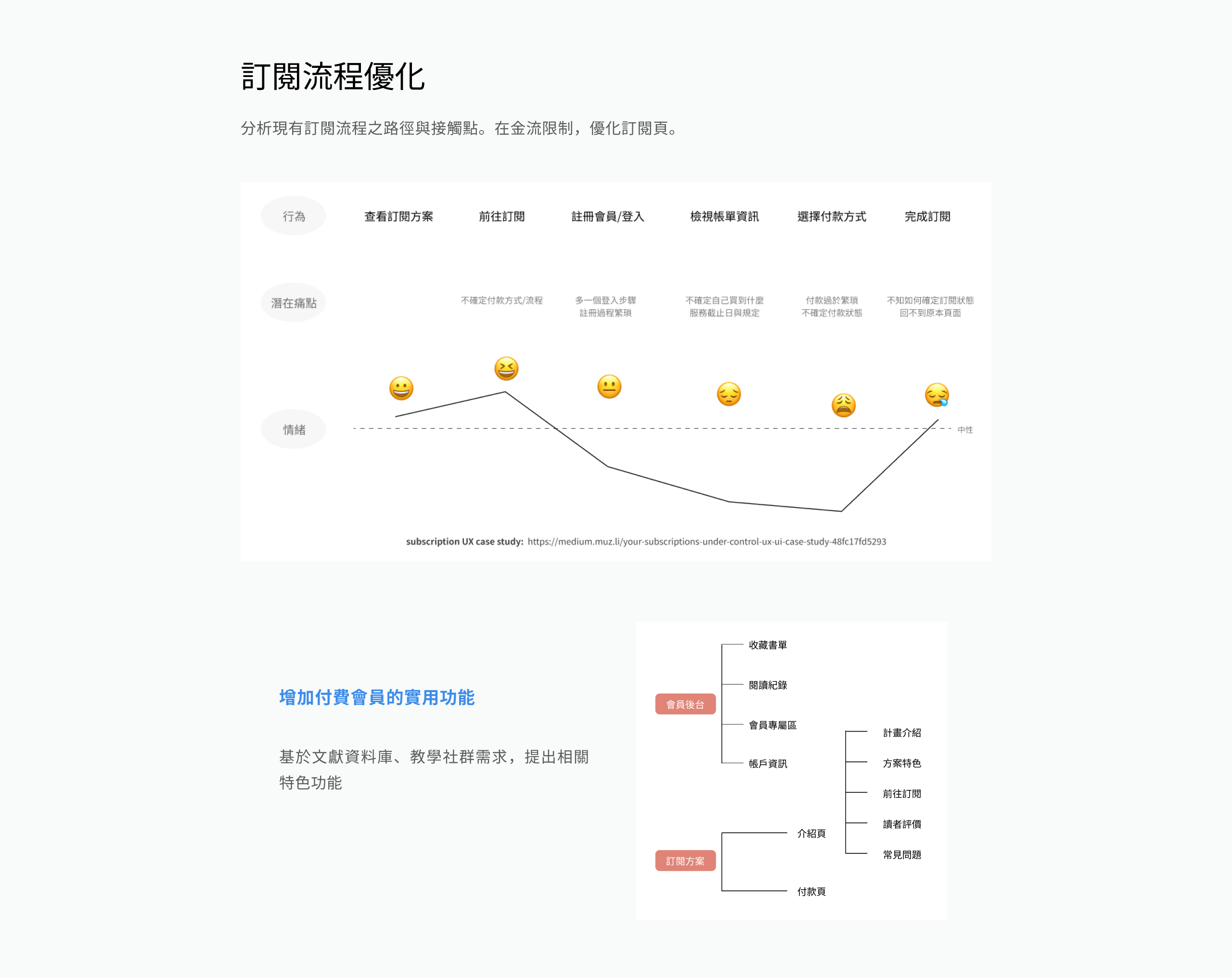
I analyzed the paths and touchpoints of the existing subscription flow. Within payment constraints, I focused on optimizing the subscription page itself, and—drawing on the needs of the literature database and teaching community—proposed new features to make paid membership more useful: reading history, saved lists, a member-only zone, and account info in the member backend, making the subscription’s value clearly visible.
Conclusion
I was involved end to end in this content-site design, from upfront research to per-page wireframes. Deliverables included:
- Needs analysis drawn from stakeholder departments, surveys, backend data, and usability evaluation
- Information architecture planning, with design principles for article classification and navigation in particular
- A redesigned site-wide Hifi-Wireframe spanning nearly 20 pages
- Subscription-flow optimization and new features to boost membership appeal
The project is live—see the StoryStudio site at storystudio.tw.
